UX
Soap.
A new website experience that brings Soap Treatment Store and Doctors at Soap together in one intuitive experience.
A new website experience that brings Soap Treatment Store and Doctors at Soap together in one intuitive experience.
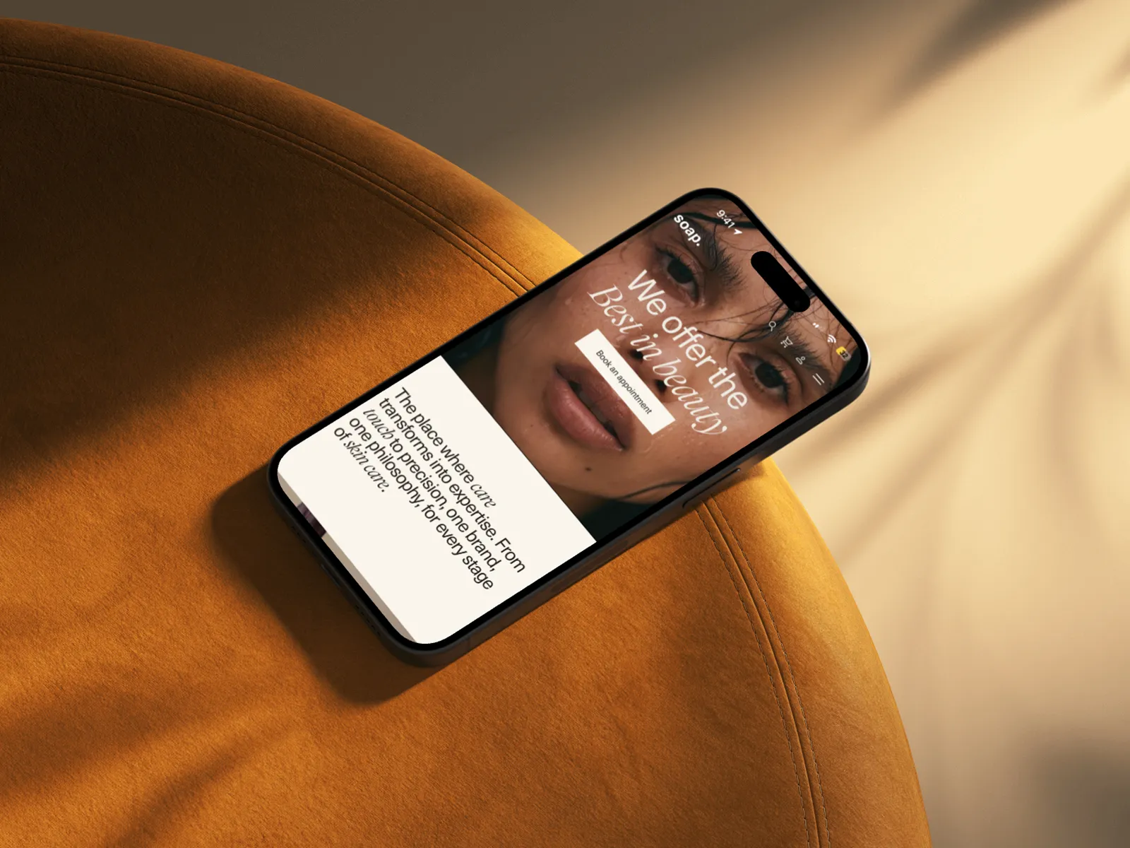
Soap’s strength is that everything happens under one roof, from easy-going facials to medical treatments. Online, however, the two sides each had their own website: one for the treatment store and one for the doctors. Both were well-known brands in their own right. Soap wanted to bring them together under one name and, with that, sharpen how it positions itself. The goal was to make it easier for visitors to discover the other side of Soap, so that someone who comes in for a facial also finds their way to the doctors, and the other way around.
The challenge was to do this carefully. Both brands had loyal customers with their own expectations, and a merged website shouldn’t make either group feel out of place. Our expert review of the existing websites and the product vision workshop brought the most important challenges to light:
In a product vision workshop with the Soap team, we explored the brand ambition, the needs of different visitors and the role of the website. Soap sees itself as an accessible clinic: professional, human and close by. Its visitors range from fashionable 25 to 45 year olds to people over 45 who want to age gracefully. Many come in for something small, like a manicure or facial, and later return for other treatments. They want to feel personally looked after, expect honest and realistic advice, and would like more clarity about price and results. For anyone who isn’t sure yet, a free consultation helps them discover what suits them.
Each visitor has their own goal. Some just want to book, others need reassurance before a medical treatment or simply want to explore. A visit to Soap is meant to feel like a boutique hotel for aesthetic care: calm, well cared for and trustworthy. The website needed to carry that same feeling, while still giving every visitor a clear path to booking, information or trust.
Vision statement from the workshop“The new Soap website is your trusted starting point for beauty. Starting from your own needs, from manicure to correction, from doctor to location, we guide you to the treatment that suits you. Even if you don’t know exactly what you need yet.”
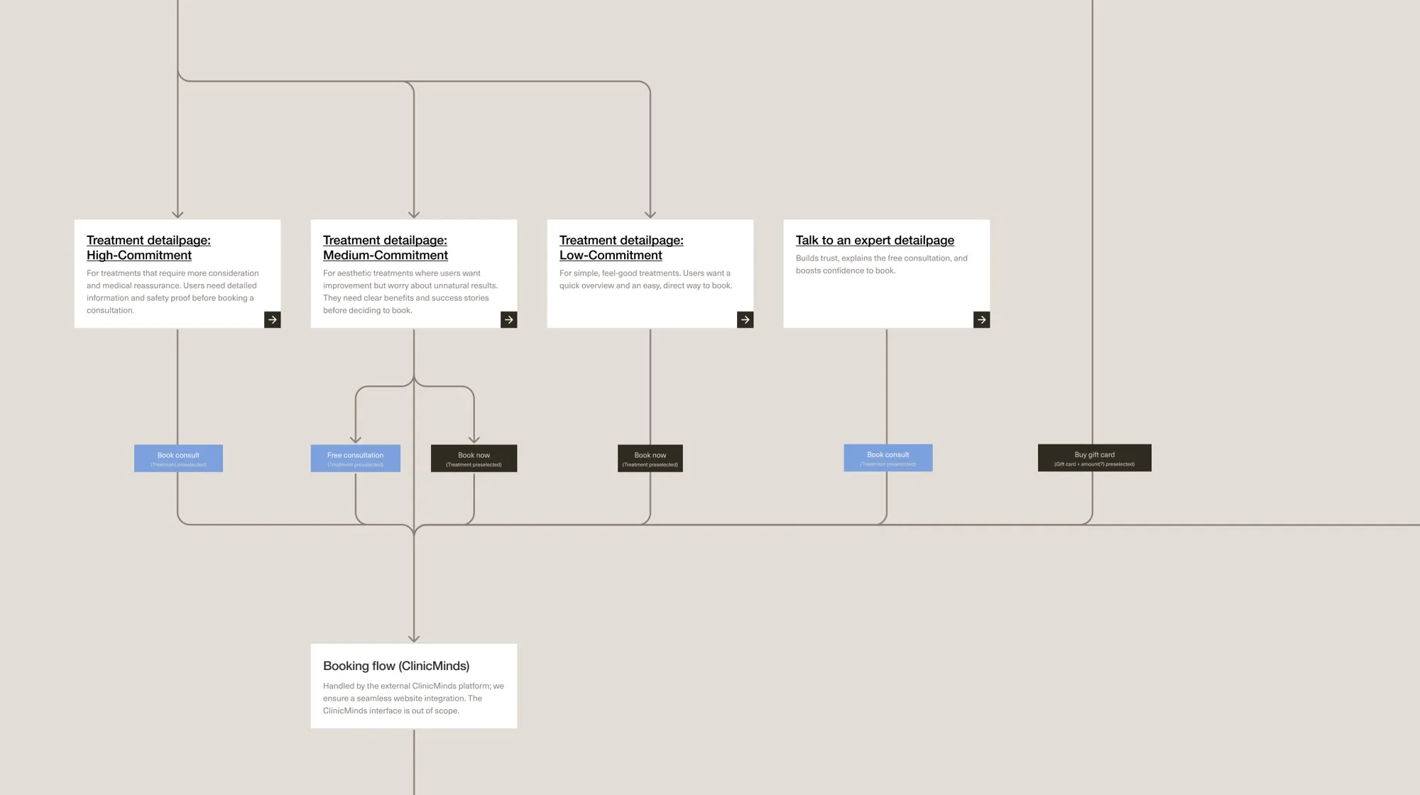
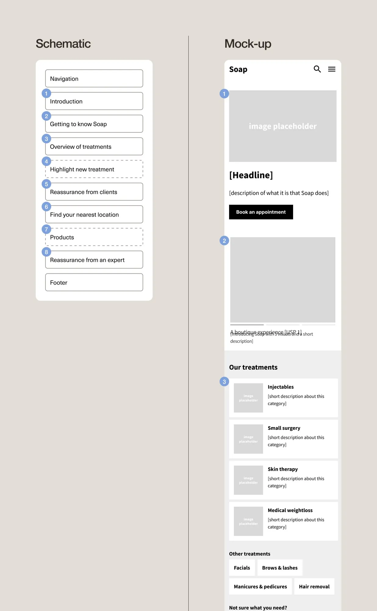
This was a team project at Soda Studio, where I worked as UX designer alongside a lead senior UX designer and a UI and brand designer. My focus was on the UX. We started with an expert review of the existing websites and a product vision workshop with the Soap team. Based on these insights, we explored different UX directions. From there, we restructured the wide range of treatments into clear categories and set up the new sitemap. We thought through the flows from treatment to booking, and worked out the structure of each page: which story it tells and in what order. All of this came together in the blueprint for the new website.
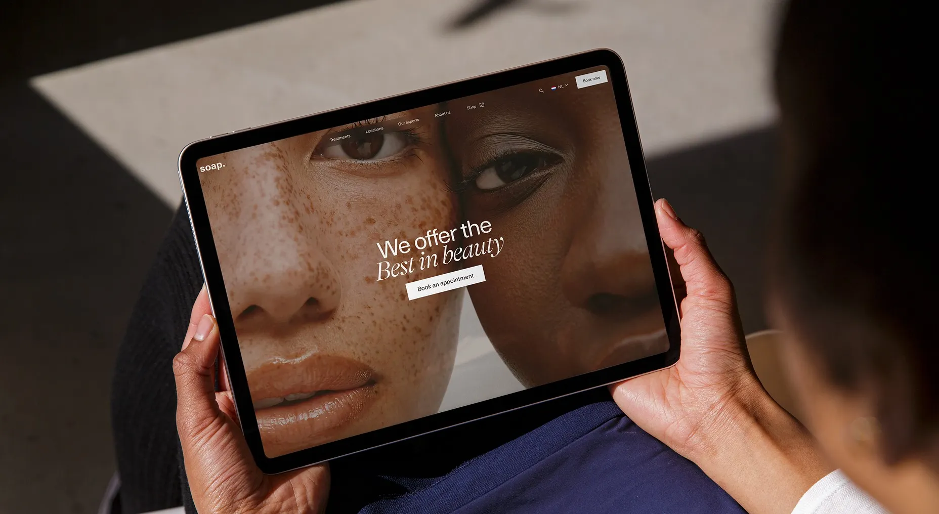
The outcome was a blueprint for the new website: a sitemap and a functional description of the core pages, with flows from treatment to booking. The goal was a website with all the answers: a clear overview of everything Soap offers, easy booking and room for reviews and the experts. The new structure brings the wide range of treatments together in a logical way, across both labels, and supports Soap’s goals: more bookings, more cross-selling between treatments and products, and a stronger, more trustworthy brand online.