Visual designBrandUX/UI
Jeugdstem.
A repositioning of AKJ as Jeugdstem, with a fresh identity, website and campaigns that reach young people in youth care.
A repositioning of AKJ as Jeugdstem, with a fresh identity, website and campaigns that reach young people in youth care.
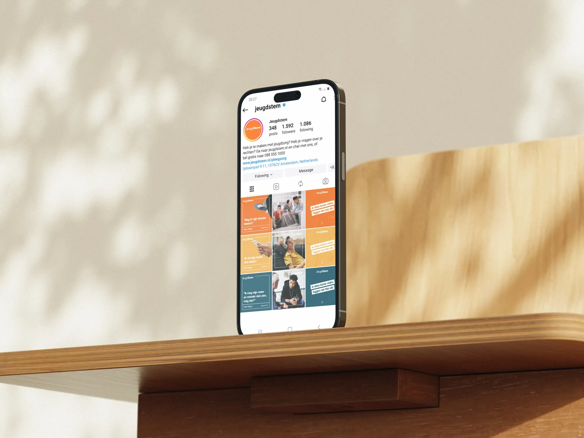
AKJ, short for Advies- en Klachtenbureau Jeugdzorg, supports children, young people and their (foster) parents with independent confidential advice when they deal with youth care. The organisation noticed that its name and identity didn’t connect well with children and young people, especially those aged 14 to 18. Many people didn’t know what the abbreviation stood for, and the word klachtenbureau (complaints office) didn’t fully reflect the supportive role of its confidential advisers.
AKJ was ready for a new name and a fresh identity that would be easier for young people to find, fit the way they communicate today, and translate well into digital content.
AKJ works in a sensitive field: youth care, the Child Protection Board and Veilig Thuis. The organisation reaches a vulnerable audience through many different channels, from Instagram, YouTube, Facebook, LinkedIn and X to its own website and physical youth care locations.
Before designing, we explored the world of the target group. We looked at the brands that appeal to young people, such as Nike, Apple and Spotify, and saw that their names are often short and their logos typographic and black. We combined this with colour theory and studies on the colour preferences of children and young people at different ages, and looked at the visual style of other organisations in youth care, where dark blue, purple and red are common. From a long list of name ideas, the three favourites were tested in an online survey among parents and professionals, and Jeugdstem came out as the clear favourite.
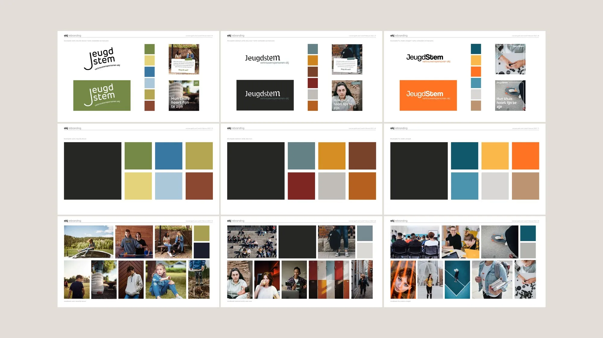
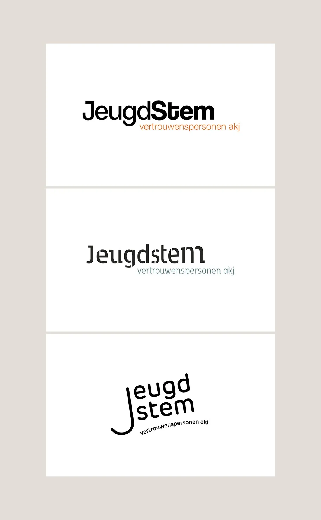
This was a team project at Concreet geeft vorm, where I worked as a digital designer, and the brand story was written together with a copywriter. Based on the research, we worked out three visual directions, each with its own logo, moodboard and colour palette. Once AKJ had chosen a direction, I translated the visual style into many touchpoints: social media posts and templates, print work such as reports, annual reports and folders, the image selection, the website structure and UI, an introduction film and the brand guidelines. After the launch, we developed three campaigns and a recruitment campaign to find new confidential advisers.
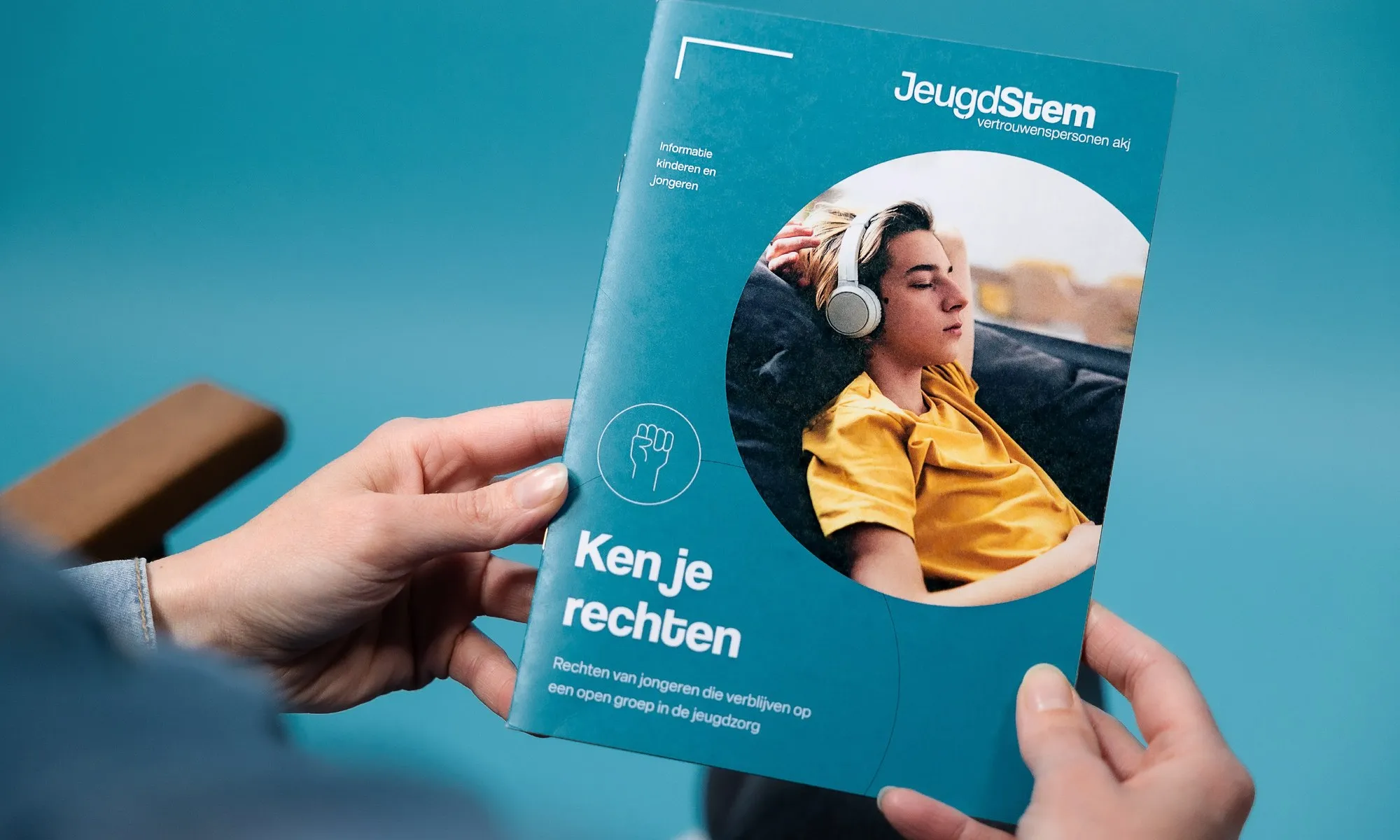
Within a year, a new name, identity, website and positioning that connect with the audience. The campaigns raised awareness of Jeugdstem through channels such as TikTok, Instagram, NPO Start and FunX radio, among young people as well as stakeholders such as juvenile court judges.